
Studio Blog
August 18th
Fundamentals of Color: Part 1 – The Basics
We are surrounded by colors at all times and at every place. Colors occur in nature, can be man-made, are a part of culture, food, art and almost every aspect of life. They have the ability to leave a lasting impression in our minds, and at times, it feels as though there is no rhyme or reason to why things look as they do. But unbeknownst to most, there are some unspoken rules that govern how we choose and utilize color. We often follow these guidelines in design and life, whether we’re aware of these principles or not, so let’s demystify the rules and see how they can be used to maximize impact and leave a lasting impression.
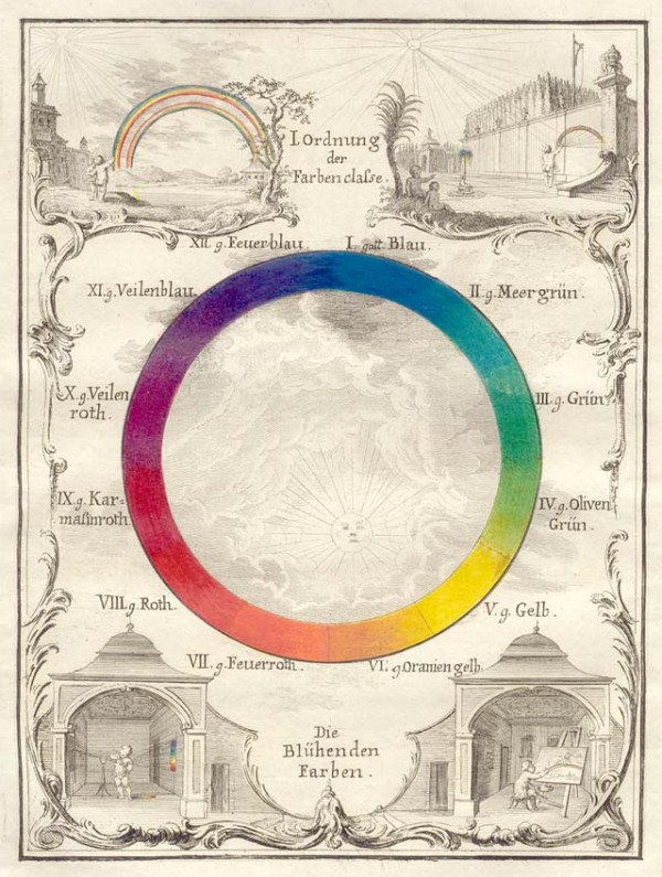
16th or 17th Century, German “The Blooming Colors” Wheel
Color Theory is defined as a principled approach to color vision that assumes three psychologically primary colors. In other words, every color in the visual spectrum can be simplified down to a combination of the primary colors: red, yellow and blue. If you’ve ever seen a color wheel or a rainbow in action, you can quickly see how this theory works. Add a touch of yellow to red and you have orange, a little blue and red and you get purple and so on….with the exception of white (the absence of color) and true black (the opposite of white) you can make any hue out of these three primary colors, which is pretty amazing when you think about it!
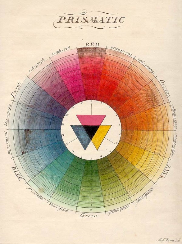
17th Century Color Wheel
The next feature of the color wheel points out the contrasting or complementary nature of colors found opposite each other in the wheel. For example red is always across from green, blue across from orange, and purple from yellow. When you pair these complementary colors you get an instant vibrant, attention catching clash of color. This is the hidden reason behind some of the most memorable color combos we see in everyday life. A few iconic examples include the LA Lakers (purple-yellow) and Christmas (green-red). There is also a secondary layer to complementary colors which pairs red with cyan, green with magenta and blue with yellow. Another example of these theories in action can be found by looking at the Ikea logo and the Swedish flag. Things can get pretty complicated from there and there are many other approaches and color theories but we’ve tried to keep it simple and highlight the fundamentals. And the visuals below should help. 😉
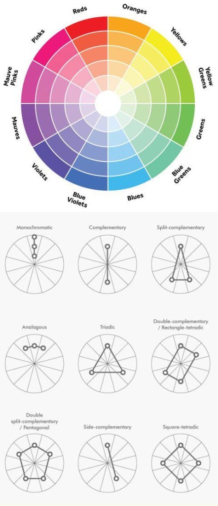
Modern color wheel with contemporary color theories
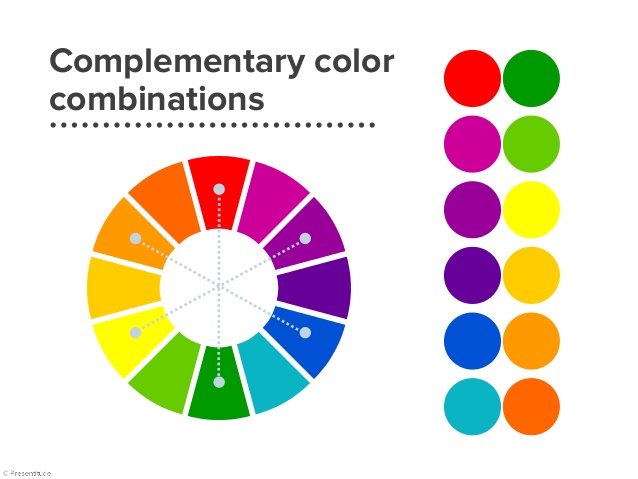
Complementary Color Combinations
Now that we’ve got the basics down, we can start to see these color codes work together to create some of the most striking and memorable color schemes in our world. The step in our color journey is the hidden meanings and emotions behind colors. Check back soon for Part 2 of our color tour!